Segmentation is a widespread analysis, bringing particular advantages to companies. It can be used in very different fields and sectors of activity such as health, industry, human sciences. Or in the top management too, marketing or finance departments for instance. In this article, we will focus on a generic methodology that adapts to the diversity of use cases. The first part will be devoted to the description of the process and the second to its implementation.

Example: American cities segmentation by socio-economic criteria click Here (generated by d3.js)
Segmentation is, by definition, the grouping and characterization of observations in homogeneous sets commonly called “clusters”. However, research and papers on the subject show that segmentation remains a difficult task, especially because of its arbitrary nature. There is a very wide range of algorithms for separating and grouping observations (unsupervised learning), and the choice of one over another is not necessarily obvious. It is also the case of the choice of the variables to be selected, why a variable represents and / or is relevant to meet the need of the analysis? These legitimate questions do not prevent the production of quality segmentation. It is nevertheless necessary to be aware of these many biases in order to exclude any missleading interpretation or analysis.
As part of a first approach, we will be inspired by the methodology proposed by the book : « Statistique exploratoire multidimensionnelle » (Dunod, Paris, 1995 ISBN 2100028863).
It is carried out in several stages:
- Dimension reduction
Dimension reduction is the analysis of compressing the information of large dataset into a small number of dimensions. There are different reduction methods, each of which has advantages and disadvantages. Principal Component Analysis (PCA) is the method used here. This algorithm uses the correlation paradigm to reduce a dataset. The advantage of using correlation is that the interpretation of the results is easier and more convenient. Although this method is rather basic, it is particularly recommended and effective for visualizing multidimensional data, while having a quantifiable and controlled loss of information.
- Unsupervised classification
Unsupervised algorithms can be based on different metrics: entropy, distance, density. The goal is nevertheless the same:
Separate observations into homogeneous sets
The Hierarchical agglomerative clustering (HAC) used here consists firstly of assigning a class by observations and then of grouping the classes progressively according to the criterion of dissimilarity chosen. It is applied directly to the PCA coordinates generated previously.
the number of clusters
Determining the optimal number of clusters in a dataset is a fundamental problem for clustering. There is no theory definitively and absolutely solving this problem, there is always a certain degree of subjectivity. Indeed, the evaluation of the similarities varies with more or less intensity according to the method used. Nevertheless, some of these methods are now consensually accepted and commonly used.
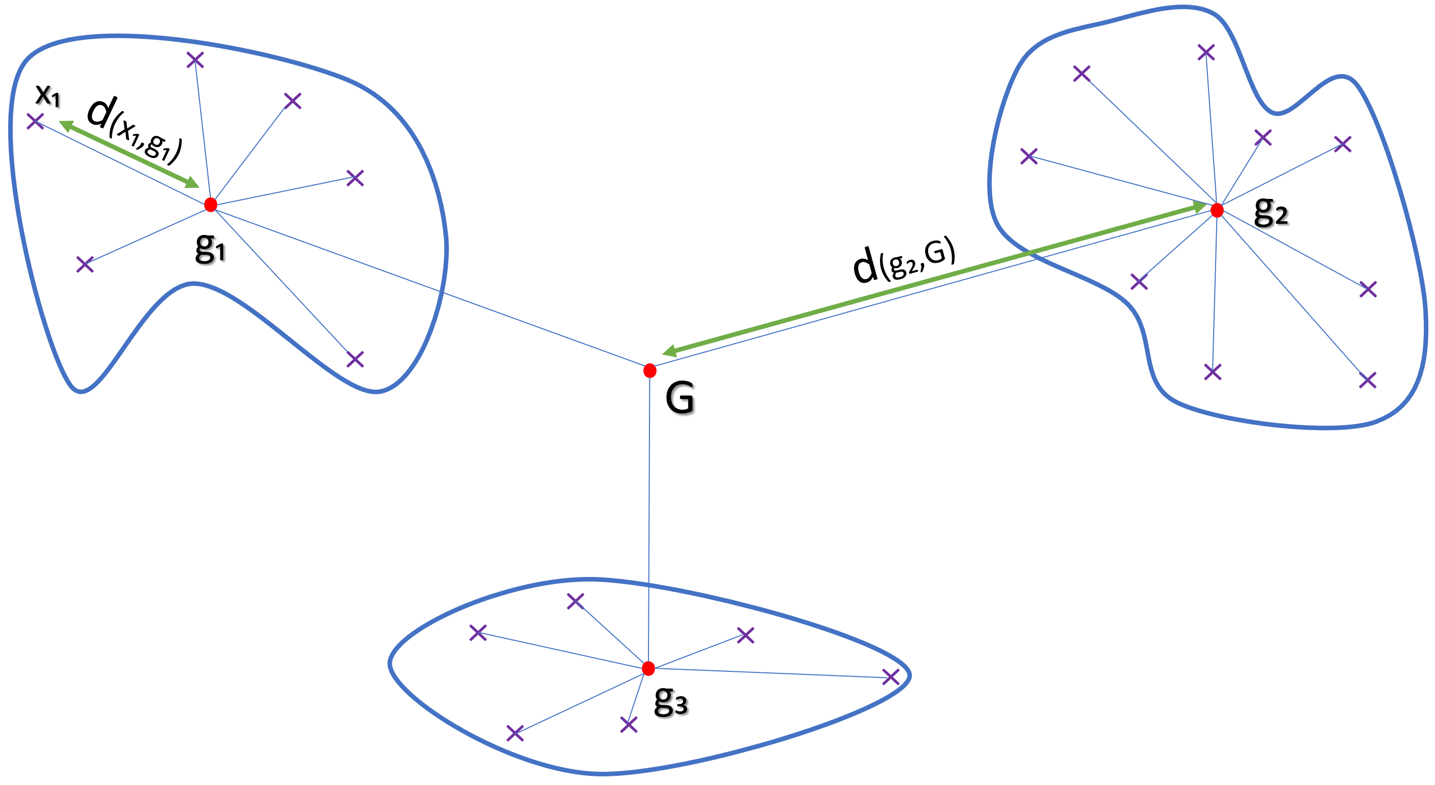
Representation of inertia inter & intra cluster
Formula 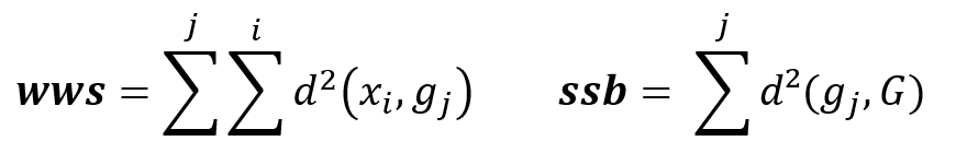
WWS : Within cluster Sum of Squares
SSB : Sum of Squares Between cluster
d(xi,gi) : Euclidian distance between dots xi and centroid gi
The goal is to minimize inter-cluster inertia (wws), or maximize inter-cluster inertia (ssb) because the total inertia of the point cloud is the sum: Total inertia = wws + ssb
- Characterization of clusters
First step:
Loading libraries and data sets.
library(FactoMineR)
library(factoextra)
library(ggplot2)
library(ggrepel)
library(DT)
library(jsonlite)

df=read.csv("wellness.csv", sep=";",dec=",",
row.names = 1, header= TRUE,
check.names=FALSE)
Second step:
Dimension reduction through PCA and intermediate result visualization.
res_acp = PCA(df, scale.unit=TRUE, ncp=ncol(df), graph=F)
df_acp=as.data.frame(res_acp$ind$coord)
fviz_pca(res_acp, col.var ="blue")
Show Results
Third step:
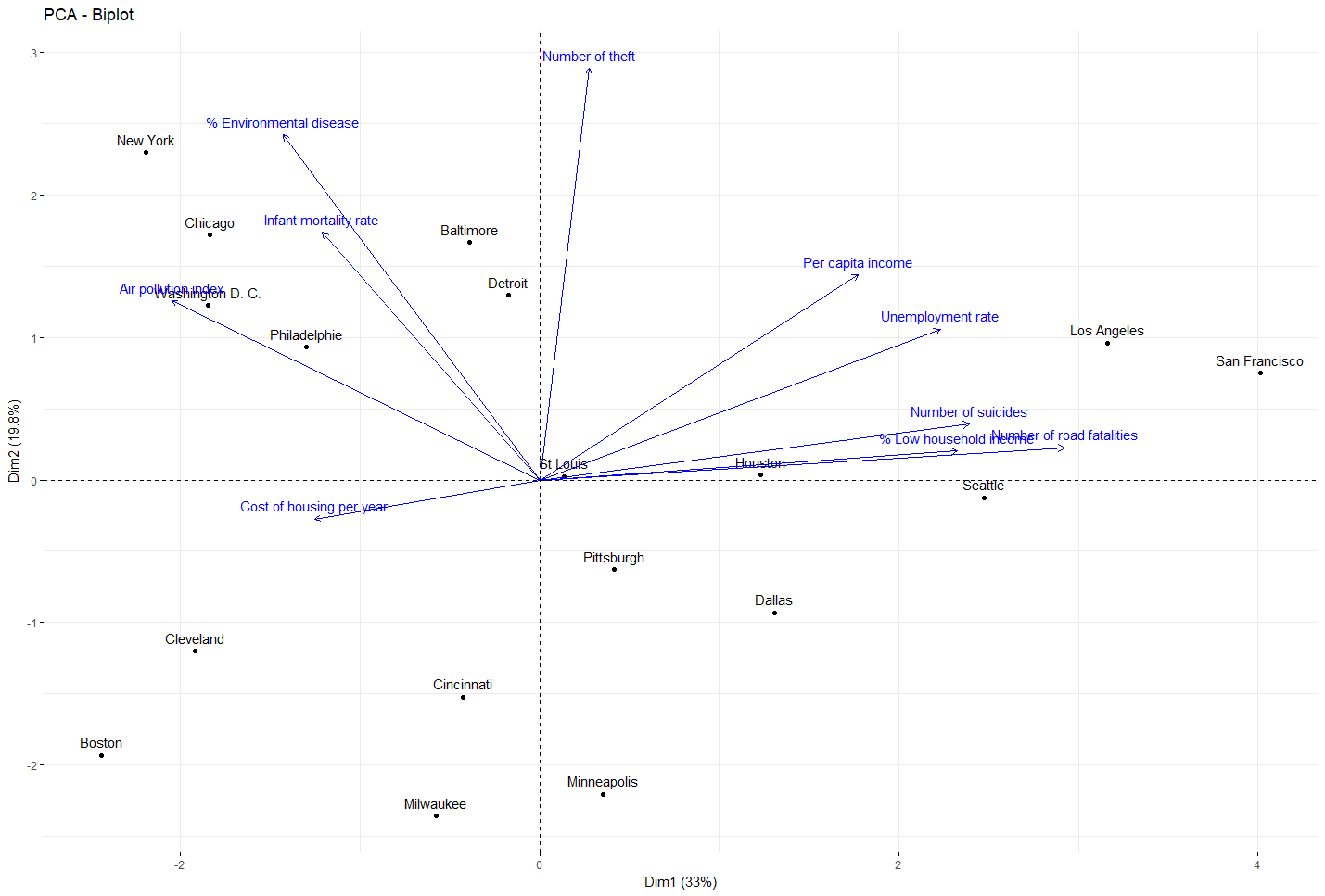
Clusterization using the HAC algorithm: The cluterization is done on the data projected through the PCA result, where the optimal number of cluster is calculated.
alpha= 0.20
opt_calc=fviz_nbclust(df_acp[,c(1,4)], hcut, method = "wss")

for ( i in 1:10){

  if(opt_calc$data$y[i+1]/opt_calc$data$y[1]<alpha){
    nb_optimal=i+1
    break
  }
}

fviz_nbclust(df_acp[,c(1,4)], hcut, method = "wss")+geom_vline(xintercept = nb_optimal, linetype = 2)
cluster=cutree(CAH, nb_optimal)
cluster=as.data.frame(cluster)
df_cluster=cbind(df_acp,cluster)
Show Results 
Fourth step:
Cluster’s characterization by z-test (normal distribution assumption)
z.test = function(k, g){

  n.k = length(k)
  n.g = length(g)
  Sk=((n.g-n.k)*var(g))/((n.g-1)*n.k)
  zeta = (mean(k) - mean(g)) / sqrt(Sk)

  return(zeta)
}

threshold=0.975
threshold.val=qnorm(threshold)

cluster_info <- data.frame(matrix(nrow=ncol(df)))
temp=data.frame()
df_c=cbind(df,cluster)


for ( j in 1:nrow(unique(cluster))){
  cat("\n","cluster ", j, "\n", "\n", "\n" )
  for (i in 1:ncol(df)) {
    statistic=z.test(subset(df_c[,i], cluster==j),df_c[,i])

    temp=rbind(temp,statistic)

    if (statistic >=threshold.val || statistic <= -threshold.val) {

      cat(colnames(df)[i],":",statistic[1],"\n")

    }

  }
  colnames(temp)=paste("cluster",toString(j[1]) , sep=" ")
  cluster_info=cbind(cluster_info,temp)
  temp=data.frame()

}
Show Resultcluster 1 % Environmental disease : 2.971881 Infant mortality rate : 2.332093 Air pollution index : 1.992268 Number of theft : 2.574825 cluster 2 Per capita income : 2.288678 Unemployment rate : 3.111431 Infant mortality rate : -2.092907 Number of suicides : 2.704074 Number of road fatalities : 2.496167 cluster 3 % Low household income : -2.045789 Cost of housing per year : 2.021008 % Environmental disease : -1.979993 Number of theft : -2.022158 cluster 4 % Low household income : 2.336857 Cost of housing per year : -2.544205
Last step:
Json generation for visualization using D3.j
path_json="viz/outfile.json"

if (file.exists(path_json)) file.remove(path_json)

cat("{",'"features":',"[",file=path_json,append=TRUE)
for(i in 1:ncol(cluster_info)){

  cat('{\n"cluster":','"',i,'",','\n','"vars"',": [",'\n',file=path_json,append=TRUE)
  cluster_info=cluster_info[order(cluster_info[,i],decreasing = TRUE), , drop = FALSE]
  for(z in 1:nrow(cluster_info)){


    if(abs(cluster_info[z,i])>=threshold.val){
      cat('{','\n','"label" :','"',rownames(cluster_info)[z],'",','\n','"value":',round(cluster_info[z,i],digit=2),'\n }',file=path_json,append=TRUE)
      if(max(which(abs(cluster_info[,i])>=threshold.val))!=z) { cat(",",file=path_json,append=TRUE) }
      cat('\n',file=path_json,append=TRUE)
    }
  }

  cat("] \n } ",file=path_json,append=TRUE)
  if(ncol(cluster_info)!=i) { cat(",",file=path_json,append=TRUE) }
  cat("\n"  ,file=path_json,append=TRUE)
}
cat("],",'"observations": [',file=path_json,append=TRUE)
res1=df_cluster[, c(1,2,length(df_cluster))]
res1=cbind(ENTRY=rownames(df_cluster),df_cluster[, c(1,2,length(df_cluster))])
colnames(res1) <- c("name","Dim_1","Dim_2","cluster")
row.names(res1)<- NULL
x <- toJSON(unname(split(res1, 1:nrow(res1))))
x=gsub("[[]", "", x)
x=gsub("[]]", "", x)
cat(x,file=path_json,append=TRUE)
cat("\n ] \n }",file=path_json,append=TRUE)
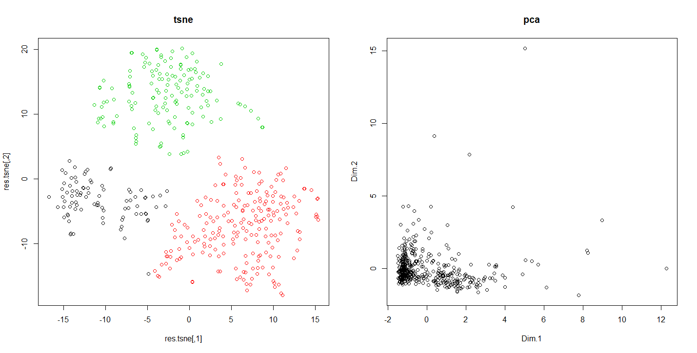
To illustrate the difference in results of the PCA and T-SNE methods. We are going to press a dataset representing the behavior of the customers in a supermarket.
Code R comparing the results of the tnse with the pca
data=read.csv2("customers-data.csv",row.names = 1,header = TRUE)
data=data[,1:8]

res.pca = PCA(data, scale.unit=TRUE, ncp=ncol(df), graph=F)
res.tsne=tsne(scale(data),k = 2,max_iter = 500,epoch = 100,perplexity = 60)

km.tsne=kmeans(res.tsne,3)

par(mfrow=c(1,2))
plot(res.tsne,col=km.tsne$cluster,main="tsne")
plot(res.pca$ind$coord[,1:2],main="pca")
Running this code shows us how according the reduction method used the results vary. This allows in this case to detect indiscernible sets otherwise.
Differences of results between tsne and pca
Conclusion
The approach presented here shows a method that can be applied in many circumstances. It can be adjusted according to the characteristics of the dataset and presents the interest to be easy to intepret thanks to a set of indicators.On the other hand, this does not save us from particular vigilance, given the pitfalls that we can be confronted with in this type of exercise.
References
[1] BellmanReferences, Richard. Dynamic programming. Courier Corporation, 2013.
[2] Benzécri, Jean-Paul. L’analyse des données. Vol. 2. Paris: Dunod, 1973.
[3] Maaten, Laurens van der, and Geoffrey Hinton. “Visualizing data using t-SNE.” Journal of machine learning research 9.Nov (2008): 2579-2605.
Very clear, even though it took me a while to understand.
I was lucky to have stumbled upon this post
I work for a major insurance company in US. Customer profiling is very important for us and your approach is fully adaptable to our challenges.
bravo! 🙂
Thank you very much