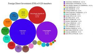
“Bubble”-plot is a different way to present your data, this kind of plotting broaden the possibilities of representation beyond the classics histograms and pie charts.
The program is based in a open-source script which has been modified to be able to add other features, for example values in percentage ,the feature’s unit of measure or optimal adaptation of the on-screen display.
The script’s input is a flat-file (CSV), where the first column is the “name” column, the second is the “value” column, and optionally a “color” column may be added.
| name | value | color |
|---|---|---|
| United States | 395995000 | #3d02f1 |
| United Kingdom | 253700405 | #8415e0 |
| China (People's Republic of) | 170556500 | #c82424 |
| Brazil | 58680000 | #e0dd15 |
| India | 44464000 | |
| Australia | 41980971 | |
| Russia (Federation) | 37440000 | |
| France | 34139488 | #15e0c0 |
| Canada | 33721141 | |
| Italy | 28951133 |
Several visualization options are available as scientific number representation, or International System (SI) prefix representation.
Options available are:
//---------------option------------
var file="data_fdi.csv";
var SHOW_NAME = true;
var SHOW_VALUE = true;
var SHOW_PERCENT = true;
var SHOW_SI_VIZ= true;
var SHOW_SCIENTIFIC_VIZ= false;
var symbol= "\u0024"   // unicode symbol format
var Size=750
var with_units = true
var with_title = true
var title="Foreign Direct Investment (FDI) of G20 members"
var show_tooltip_for_small_bubbles = true
This script has been tested in Firefox, so that it works on other browsers follow the process here (it should work in any browser). A “data-embedded” version is available here
Data used in this example represents the FDI of G20 countries, data were extracted from OECD (OCDE) (http://stats.oecd.org/)
NB: The EU data were excluded in order to avoid any redundancy of information.

